
BikeBud
Designing a safer, smarter and more rewarding way to commute by bike in Los Angeles
When I moved to LA, biking was how I got around, and I quickly found that the city's navigation apps weren't built for commuters like me. BikeBud is a cycling app that puts safety, time and local rewards first.
Brand and industry
Mobility · Mobile app concept for LA bike commuters
My role
UX/UI Designer
Springboard UI/UX Design capstone. I owned the project end to end: research, interviews, wireframes, prototyping and testing.
The challenge
Only about 1% of LA commuters bike to work. Safety concerns, unreliable routes and few incentives keep people off their bikes, even when biking is faster, cheaper and healthier.
Mainstream navigation tools are built for cars, and bike apps are built for fitness. No app brought together bike-specific routing, community and rewards for everyday commuters.
How might we make bike commuting in LA safer, more enjoyable and supported by a thriving community?
What I did
Researched what motivates riders
Secondary research surfaced five motivators: safety, time, savings, health and community. I then interviewed 5 cyclists, 3 commuters and 2 fitness riders. Everyone cared about safety and clear routes, and most wanted to be rewarded for riding.
Set four design priorities
- 1. Commute efficiency
- 2. Reliable navigation and timing
- 3. Health tracking
- 4. Community and local rewards
Designed and prototyped
I went from sketches to low-fidelity wireframes to a mid-fidelity prototype for guerrilla testing, then to a high-fidelity MVP. Key features:
- · Turn-by-turn navigation with optional smartwatch sync
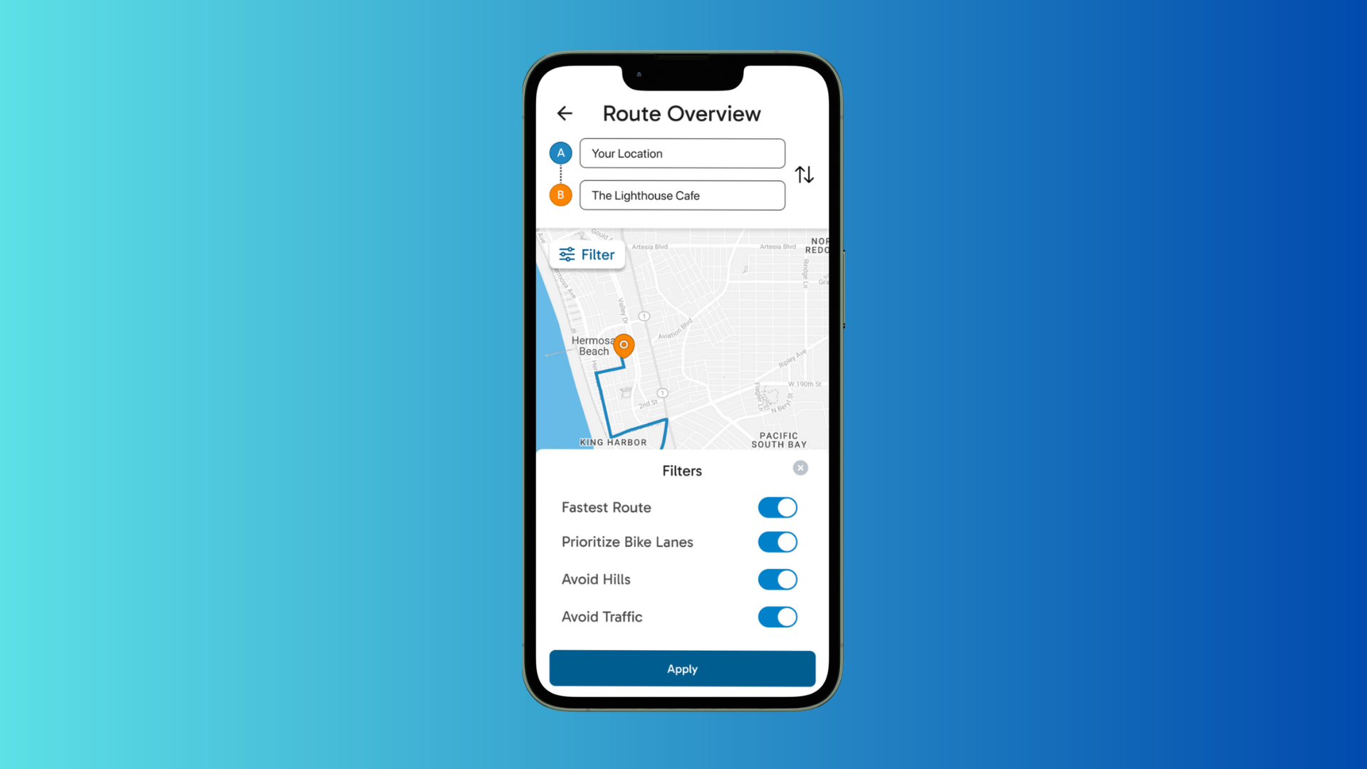
- · Route filters to avoid hills and heavy traffic
- · "Leave Later" reminders for planned rides
- · Local rewards, with vouchers from nearby businesses sorted by distance
Tested twice, then fixed what broke
Two rounds of moderated usability testing with 10 participants, using Maze and in-person sessions, surfaced clear friction points:
Try the prototype
A live, clickable version of the app. Tap through the flows — it works best on a phone-sized screen.
The results
| What users struggled with | What I changed |
|---|---|
| 3 of 5 didn't see the route filters | Made filters more prominent in the layout |
| Users assumed filters were already applied | Applied filters by default, with optional edits |
| "Go Now" vs. "Leave Later" was confusing | Redesigned the button hierarchy |
| Voucher addresses were hard to use | Showed distance instead of full addresses |
| Sign-up forms felt long | Added Apple and Google sign-up |
Key features like filters and reminders became easier to find between testing rounds. Planning a ride took less friction, with clearer routes and calls to action. Navigation, rewards and health stats came together in one cohesive app. A high-fidelity Figma prototype with validated user flows was ready for handoff.
What I learned
Small friction causes big drop-offs. Even the best feature means little if users can't find it. Riders weren't asking for another fitness tracker; they wanted an app that understood their commute, and rewards gave them one more reason to ride.
Visuals
1. Commuter persona
Evan’s goals and everyday frustrations grounded the design in the needs of LA bike commuters.
2. Initial sketches
Early route, navigation and ride-summary ideas, annotated during guerrilla testing.
3. Mood board
Cycling imagery and interface references shaped an approachable, dependable direction.
4. Heat maps & usability testing
Maze click patterns alongside the in-person sessions that informed the next iteration.