Better Beauty
Brand identity for a beauty and wellness retailer
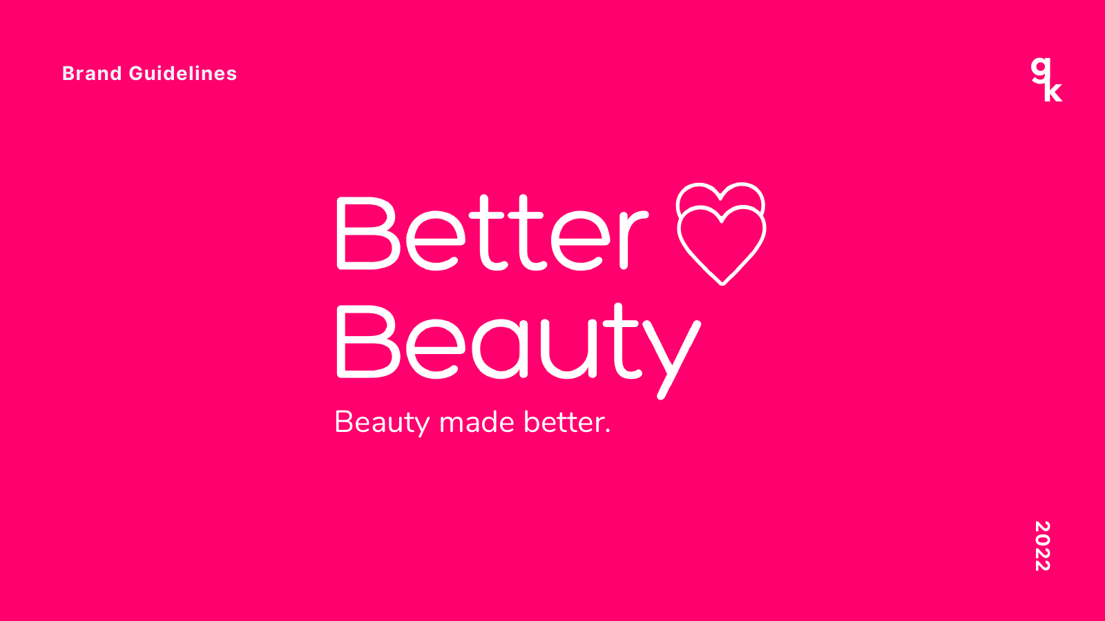
A full brand identity for a beauty and wellness store with its own product line, built around one promise: beauty made better. The direction: bright, inclusive and approachable, with self-care that feels easy and for everyone.
Brand and industry
Beauty and wellness retail · E-commerce
What I made
Brand foundation
Three brand pillars to guide every touchpoint: beauty made better, beauty made easy and beauty made for all.
Logo system
A wordmark with a heart, plus color variations, a secondary logo and a "BB" display icon for profile photos and app icons.
Color palette
Hot pink, deep teal and rose as primaries, with a playful secondary palette of pastels and warm neutrals.
Typography
Hero for headings, Nunito for subheadings and Roboto for body copy.
Visual assets
A sticker set ("Self-care is for everyone," "Take care of yourself") that gives the brand a voice across packaging and social.
Collateral
Marketplace banners for Lazada and Shopee, plus feed and Story templates for social media.
Visuals
1. Logo variations
The wordmark across the palette.
2. Display icon
The ‘BB’ mark for small spaces.
3. Color palette
Primary and secondary colors.
4. Visual assets
The brand’s sticker set.
5. Marketplace banners
Lazada and Shopee carousel banners.
6. Social feed posts
Product and campaign templates.
7. Social Stories
Vertical templates for product launches.