
Maya Business Missions
Turning an ignored rewards feature into a gamified experience
At Maya, one of the Philippines' largest fintech companies, I redesigned Missions, a rewards feature built to get merchants exploring the app. Two rounds of testing took task success from 25% to 100%.
25% → 100%
Task success rate
14.5% → under 5%
Misclick rate
40%
Shorter flow
Brand and industry
Fintech · Digital payments and banking for merchants
My role
UX Design Intern, Maya Business team
I owned the Missions redesign end to end: audit, competitive analysis, UX and UI design, and usability testing. I did it during Maya's rebrand from PayMaya, while the company rebuilt its entire design system.
The challenge
Maya Business offered valuable services like bill pay, referrals and top-ups, but most merchants only used the app for basic transactions. Missions was meant to change that by rewarding merchants for trying new features, but almost no one used it.
Audits and usability testing showed three core problems:
- Low awareness: merchants didn't know Missions existed. "I didn't even know I could earn anything here."
- Unclear value: terms like "Points" and "Cash" were confusing. "What's the difference between this and cashback?"
- No feedback: the flow ran 26+ screens with no sense of progress. "It's hard to tell what I'm supposed to do next."
What I did
Audited the experience
I mapped the full 26-screen flow and ran a competitive analysis of GCash, GrabPay and Coins.ph to find the reward patterns and emotional hooks that worked.
Reorganized, not just redesigned
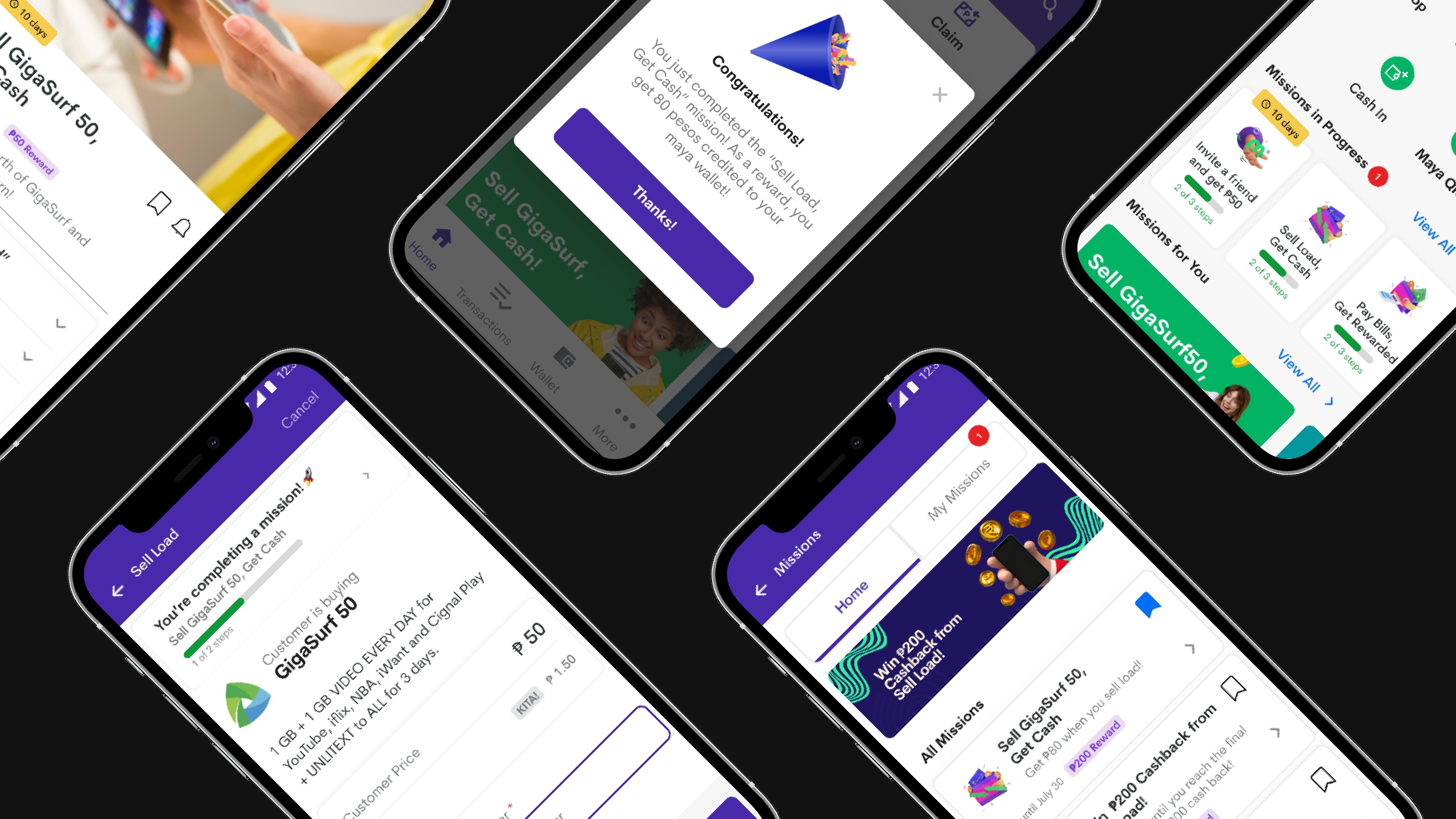
I moved Missions onto the dashboard for visibility and built missions into the actions merchants already take. I also rewrote reward terms so the value was instantly clear.
Designed for motivation
Taking cues from games, I added progress tracking and visual rewards that made completing a mission feel like a win, all within Maya's new design system.
Tested, failed, iterated
Round 1 was humbling: 25% task success, a 14.5% misclick rate and an average task time of over 6 minutes. I reworked the copy, layout hierarchy, button logic and progress feedback, then tested again.
The results
| Metric | Round 1 | Final |
|---|---|---|
| Task success rate | 25% | 100% |
| Misclick rate | 14.5% | Under 5% |
| Flow duration | 26+ screens | 40% shorter |
Results from 2 rounds of usability testing with 5 participants each, using Maze and in-person sessions.
My high-fidelity prototype became the guide for Maya Business's Missions MVP development.
What I learned
Missions didn't need more features. It needed a story merchants could follow. Clear structure, plain-language rewards and small moments of feedback turned a task into a motivator, and that applies to every loyalty program I've built since.
Visuals
1. Before state
The Missions experience merchants saw in the Maya Business app before the redesign.
2. Low-fidelity wireframes
Mapped the path from discovering a mission to tracking progress and claiming a reward.
3. Mid-fidelity screens
Developed the screen layouts, mission details and progress feedback before refining the visual design.
4. Final designs
Brought Missions into Maya’s design system, with visible progress, clear rewards and a focused dashboard.